


Designed a task-based travel planner app, enhancing user experience by simplifying trip planning, and conducted accessibility testing to refine visual design
CONTEXT
The Travel Planner App is to simplify the travel planning process, ensuring that users can embark on their journeys with confidence and convenience. This is an academic project where the application idea and purpose have been given. We need to choose some user stories to make the user flow and than design the application, which will be user-friendly and visually appealing
MY ROLE
As a UI/visual designer, I utilized wireframes, and visual design principles to create intuitive user interfaces, enhance visual appeal, and optimize user flows for seamless navigation.
TIMELINE
16 weeks
projected based on visual design, user research, and competitive analysis.
METHODS
Analyzed color theory application, user behavior, survey results, mental model, refine user flow, proposing impactful solutions through iterative design, presenting findings and suggestions
This project was all about tackling specific tasks. I was given a fun challenge: choose 5 key travel tasks and turn them into a simple, beautiful app using the full design process from research to final visuals.
THE OBJECTIVE AND TASK PROVIDED
OBJECTIVE
To design a user-friendly travel planner application that simplifies itinerary creation, booking processes, and real-time travel updates.
TASK PROVIDED
As a frequent traveler, I want to be able to create and save multiple trip itineraries inthe app, complete with dates, destinations, and activities, so I can easily plan and organize my upcoming trips.
As a budget-conscious traveler, I want the app to provide recommendations for affordable accommodation, transportation, and activities at my chosen destination, so I can plan acost-effective trip within my budget.
As a traveler exploring a new city, I want the app to offer interactive maps with points of interest, restaurants, and public transportation options, so I can navigate the city easily and discover new places to explore.
As a group traveler, I want the app to allow me and my friends to collaborate on trip planning, including voting on activities and sharing our itineraries, so we can ensure everyone has a memorable and enjoyable experience
As a traveler with a busy schedule, I want the app to send me timely reminders and notifications for flight check-ins, hotel bookings, and activities during my trip, so I can stay organized and avoid any last-minute hassles.
USER FLOWS: MAPPING THE JOURNEY
With the UX task given in hand, I created multiple user flows as per the task assigned to better understand all screens and features the user may encounter while attempting to achieve their goal.
I drew step-by-step paths to show how someone would move through the app to do each task.

Describe your image

Describe your image

Describe your image
Describe your image
MID-FIDELITY WIREFRAMES: THE BLUEPRINTS
I used a 4-column grid in Figma to structure the mobile screens, helping transition the wireframes from low to mid-fidelity with clearer content organization.
Then, I sketched the semi rough screens to bring the travel app to life, like drawing the outline before coloring it in.
MOODBOARD
Travel Planner is designed for everyday travelers looking to organize their trips with ease and joy. This mood board captures a sense of excitement and simplicity through vibrant colors, playful icons, and clean, approachable design elements.

Here’s a glimpse of the style guide and design system that powered our project, an essential framework that ensured consistency, usability, and scalability across every touchpoint!
STYLE GUIDE
I picked colors that are friendly, accessible, and easy on the eyes. I also chose fonts that are clear and readable for everyone.
In the style guide for Travel Planner, I chose a vibrant yet balanced color palette to reflect the excitement of travel while maintaining clarity and accessibility. Warm, inviting hues like coral and sky blue were selected to evoke energy and friendliness, while maintaining strong contrast for readability. These colors were tested for accessibility and visual harmony, ensuring they guided users intuitively through the app without overwhelming them.
While crafting the typography, I referred to Thinking with Type by Ellen Lupton. This book helped me understand the principles of hierarchy, spacing, and readability, ensuring that every text element in the app supported clarity, accessibility, and visual harmony across all screens.


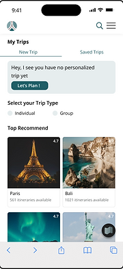
Ta-da!! The prototype and final designs - where all the testing and iterations come together to create a polished, user-centered experience
DESIGN AND PROTOTYPE: THE FINAL LOOK
Here’s a look at the final designs and interactive prototype, bringing all the user flows, strategy, and visual decisions together.
Explore how each screen guides the user smoothly through their travel planning journey.

INVIGILATOR FEEDBACK
I love how the map is right there, it makes it so much easier to visualize my trip and plan everything in one place. The calming colors and clean layout actually make planning fun instead of stressful!
KEY FEATURE
Interactive Map Integration
Accessible UI Design
Map-First Experience
Personalized Itinerary Builder


KEY TAKEAWAY AND LEARNINGS
Visual Flow Builds Confidence
Establishing a clear, map-first interface helped users feel oriented and in control throughout their planning process. (Highlights the power of visual anchors in UX.)
Design Systems Enable Growth
Establishing a consistent visual language and component library ensured scalability across screens and future features, making the product easier to expand and maintain.(Highlights the power of design systems for long-term efficiency and consistency.)
Simplicity Elevates Design
Reducing clutter and applying thoughtful color and type choices made the app not just accessible, but delightful to use.(Emphasizes the impact of visual hierarchy and consistency.)
MORE PROJECTS
Product Design
User Research
B2B
SaaS
Digital wallet
Most impactful

Internship | 20 weeks
UX/UI Design
User Research
B2C
Entertainment service
Most impactful

UX Research
Card Sorting
Tree Testing
User Interviews
Most impactful

Product Design
User Research
Surveys
0→1
Intuitive journey
