
Led a usability study with 11 users and 14 tasks to evaluate Manduka’s site experience leveraging competitor analysis and data insights to achieve 89% task success and drive key improvements in navigation and usability.
CONTEXT
Manduka is a leading yoga brand focused on sustainable, high-performance products. Their website serves as a central hub for customers, educators, and studios worldwide to explore products and deepen their practice. I conducted a usability study on their website to evaluate its navigation and overall user experience. Through user testing and research, I uncovered key pain points and identified opportunities to make the site more intuitive and user-friendly.
MY ROLE
Led comprehensive UX research, leveraging user testing to uncover actionable insights that informed iterative design decisions and drove strategic improvements
TIMELINE
16 weeks
projected based on information architecture and user research
METHODS
Usability testing, user group outreach, competitive analysis.
accessibility evaluations, Refine user flow ,s. Utilized card sorting, tree testing, and qualitative data analysis
THE OBJECTIVE AND PROJECT GOALS
OBJECTIVE
Rethink the website navigation to create a more intuitive and seamless browsing experience, helping users find products effortlessly.
Ensure the design supports both new and returning users by reducing friction and highlighting key offerings effectively.
PROJECT GOALS
Assess the navigation, item mapping, and overall clarity of product categorization on the site.
Identify any usability issues that hinder users from completing key actions, such as browsing for items and checking out.
Determine if the new structure provides an intuitive experience for both first-time and returning users.
MY RESEARCH PROCESS
USABILITY TESTING: CARD SORT AND TREE TESTING
After some time, I gained some of the key insights from exercise
The card sorting exercise revealed user confusion around categorization, but most participants naturally grouped content into four main topical areas: product/mat pages, assistance, community, and quick access.
Tree testing showed that users struggled less when content was organized by topics rather than user types, reinforcing that a topical structure supports more intuitive navigation for a broader audience.
These findings confirmed that a topical organization not only improved content clarity and usability but also aligned better with Manduka’s goal of creating a unified and accessible website experience
Usability testing overview
11 Participants were considered
14 tasks
Card sort
Tree Jack
89%
Task success
3m 6s
Avg. time for card ort
1m 5s
Avg. time for tree jack
CARD SORT DATA RESULTS
Cards provided to user

14 cards •
3 category
Result accumulated by testings
As the study had fewer participants, the best merging approach outperformed the real agreement method. Based on individual pair relationships, it develops assumptions about bigger clusters.


Analysis showed that cards categorized in about 2-4 different categories, showing some data to help for further research.
TREE TESTING RESULTS


What I analyzed with the result I received
1
Card sort and tree testing showed user confusion around categorization, but most grouped content into four clear topical areas: product/mat pages, assistance, community, and quick access, highlighting the need for a clearer structure.
1
A topical organization scheme proved more effective than an audience-based one, as it allowed all users to navigate the site easily without restricting access based on user type.
1
Topical structuring improved usability, consistency, and SEO, while also addressing mobile usability challenges, making it the more practical and scalable choice for Manduka’s redesign.
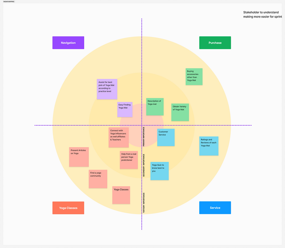
AFTER RECEIVING THE RESULTS, I CONDUCTED A RADAR MAP ANALYSIS
The radar map analysis showcased how users categorized the content, revealing clear patterns across four key areas: product and mat pages, assistance, community, and quick access. This visualization highlighted both strong and weak areas in the site’s structure, helping prioritize navigation improvements and guiding decisions to streamline user flow and enhance overall engagement.
NAVIGATIONAL UNDERSTANDING
Task assigned for the site map and the concept map
Using the findings from your card sort exercise, determine if you will keep the current organization scheme for the site or if you think a new one is needed. Using at least 3 sentences, state your decision (current versus updating).
Decision after finding and understanding the result
I realized a topical organization scheme was more appropriate because it structures content by subject or theme, rather than by audience type.
An audience-based scheme would require dividing the site into distinct sections tailored to specific user groups (e.g., "For Teachers," "For Beginners"), which this structure does not do
Reasoning behind the decision
a
User Confusion Highlighted the Need for Clarity
The card sorting exercise revealed that participants struggled to classify items confidently, uncovering a lack of clarity in content structure. Most naturally grouped content into four topical categories: products, assistance, community, and quick access, highlighting the need for a more intuitive layout.
b
Topical Organization Emerged as the Optimal Approach
While some users initially expected audience-specific groupings, the findings showed that a topical scheme better accommodated diverse user needs by offering universal access to content—unlike an audience-based model, which risks limiting discoverability.
c
Improved UX and Brand Consistency Through Topical Structuring
Adopting a topical scheme supports better usability, enhances content discoverability, and maintains a consistent, brand-aligned structure across the site ultimately leading to a smoother user experience and stronger SEO performance.
SITEMAP AND CONCEPT MAP
Think Manduka has it all figured out as a top brand? Think again! Check out the surprising usability findings we uncovered through research; scroll down to discover how even the best can get better!
USABILITY ISSUES AFTER USER INTERVIEW AND FEEDBACK
USABILITY ISSUE: 01
Issue
Users were facing problems reading the text that was merging with the background color. People with color blindness would not be able to read the text easily.
Recommendation
Check whether the accessibility colors match the foreground and background colors by contrast checker with a ratio of at least 4.5:1.


USABILITY ISSUE: 02
Issue
On the mobile view, the design changes the size of the font and padding. The padding is too little for a user to engage. In the overall website, there are spacing and size issues with icons also. It doesn't follow basic guidelines for size.
Recommendation
Increasing the size of the font and the icons in the mobile view, the text that is under the hamburger menu, seems congested. The upper nav bar has a lot of elements; places icons can be considered somewhere else.
ADDITIONAL RECOMMENDATION
By Introvert users
Competitor analysis
To better support users with limited scheduling flexibility or introverted preferences, Manduka could offer an experience similar to MuscleWiki, allowing users to select a body area and instantly view relevant yoga content,
and provide a clear mat comparison chart to reduce clicks and simplify decision-making.

Reference Link
SEO SCORE
Backlinks
Dec 2024
180.7K
User Traffic
Jan 2021-Dec 2024
32.55% Decrease
Authority Score
Till Dec 2024
47
Mobile Users
Poor Mobile UI leads to 60%
BUSINESS IMPACT AND SOLUTION
Insights were drawn from both structured testing and real-time user behavior
Backlink Issues & User Trust
Too many low-quality backlinks are hurting user perception and site engagement
Mobile UI Accessibility
Small icons and touch targets on mobile frustrate users and lead to higher drop-off
SEO & Business Performance
High bounce rates signal dissatisfaction, lowering search visibility and organic reach.
Mobile-First Review Experience
Some tools on mobile reduce submissions and user interaction.
Possible solutions that can be implemented for the impacts
Audit Backlinks
Filter and remove poor-quality backlinks to boost SEO and rebuild trust.
Enhance Mobile UI
Filter and remove poor-quality backlinks to boost SEO and rebuild trust.
Monitor Engagement Metrics
Use real-time data to identify pain points and measure improvement.
Optimize User Behavior Analytics
Switch to mobile-optimized platforms to enhance user engagement and ease of use.
MORE PROJECTS
Product Design
User Research
B2B
SaaS
Digital wallet
Most impactful

Internship | 20 weeks
UX/UI Design
User Research
B2C
Entertainment service
Most impactful

Product Design
User Research
Surveys
0→1
Intuitive journey

Visual Design
Color theory
Typography
Intuitive journey
