

Researched and redesigned the vendor experience for an event services and ticketing app, improving user flows, boosting usability by 12%, and enhancing usability testing.
CONTEXT
Immer is an integrated platform driving innovation in the live events industry, offering immersive, tech-powered solutions for artists, organizers, and venues. By streamlining everything from virtual event experiences and venue booking to ticket sales, promotion, and audience engagement, Immer empowers creators to take full control of event production, management, and monetization.
MY ROLE
UX/UI designing, using navigation data to refine tasks, optimize sprints, and enhance user experience.
TIMELINE
5 months
3 phases to launch
Continuous Iteration
TEAM
10+ Designers,
4 Product Managers,
5+ Developers
METHODS
Usability testing, Heuristic evaluation, Competitive analysis.
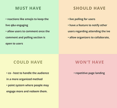
Crazy 8's ideation, Refine user flow ,Problem identification, Solutions design
WHY DID IMMER DEVELOP A REAL-TIME EVENT COMMUNICATION SYSTEM
In our increasingly digital lives, managing personal identity and financial information can be overwhelming. Users often face confusing interfaces, scattered information, and security concerns. Shoptaki aimed to change this by introducing SmartID: A tool designed to give users control over their digital identities with ease and security
HOW I CONTRIBUTED
My goal was to transform Immer into an intuitive and reliable event management platform, with a primary focus on the live participation and notification systems. I concentrated on:
User Research
Focused on identifying communication gaps and notification requirements
Design Simplification
Crafting a clean, easy-to-navigate interface that not only built user trust but also a uer enagaging flow.
Engagement Feature
Implementing interactive tools and features for better communication
Before diving into the product, let's understand the problems, gaps and the solution
Problem
Vendors on Immer’s platform faced challenges in staying informed about real-time event updates. They had to keep up with live updates, and users hesitated to speak during sessions, leading to confusion and low engagement during events.
Gap
There was no single place to get real-time updates, so vendors missed important info like adding co-hosts or special requests. To fix this, we designed a dedicated Notifications & Alerts screen to keep everything in one spot.
The solution provides real-time updates through live chat participation and adding polls, enhancing vendor-organizer-attendee interaction to chat live and join polls. It helps vendors, organizers, and attendees talk to each other better, stay informed, and work more smoothly.
Solution
My journey to the task solution
MY PATH FROM CHAOS TO CLARITY


THE OBJECTIVE AND CHALLENGES
OBJECTIVE
Redesign a real-time engagement system that keeps vendors informed during live events, allowing them to respond promptly to attendee needs.
Create a centralized hassle-free user-engaging communication hub to streamline communication between organizers, vendors, and attendees during live sessions
CHALLENGE
01
Implement live Q&A participation audio feed and notifications alert features, making real-time interaction the core value of the platform during events
There was a lack of user engagement during live streaming or event sessions, as hosts couldn't provide vendors with real-time notifications and alerts from attendees, hindering the event experience and requiring a solution that prioritized immediate communication.
CHALLENGE
02
Redesign the vendor host and co-host system while live events are happening, as it requires vendors to constantly monitor multiple users and co-hosts to keep track of user engagement.
There was a lack of coordination tools for managing multiple participants during live sessions, as vendors struggled to effectively monitor audience interactions and delegate responsibilities to co-hosts, hindering efficient event management and requiring a solution that prioritized seamless collaboration.
IDEATING USER FINDINGS
Noted pain points and design gap
Fragmented User Communication
Vendors struggled to receive engagement from users during event
Vendors felt confused and boring
Manual Monitoring
Required constant attention to track participant activity during live events
Process felt exhausting and reduced focus
Limited Engagement Tool
72% of vendors reported difficulty collecting real-time attendee feedback
Lack of interactive features for meaningful audience participation
Co-Host Coordination
Vendors struggled to delegate tasks to co-hosts during live sessions
No clear permissions structure for different roles
Usability testing before changes
20 Participants were interviewed
5 tasks
30 minute session
61%
Task success
9.7 s
Avg. time per task
68/100
User satisfaction score
LET ME WALK YOU THROUGH SOME KEY INSIGHTS
CSD Matrix
I used this framework for outlining and visualizing what everyone involved in a project knows (Certainties), hypothesizes (Suppositions), and doesn't know yet (Doubts)

%201.png)
UNDERSTANDING COMPETITOR AND FILLING BUSINESS GAPS
TWITTER X SPACE
Twitter X Spaces offers live audio conversations within its broader social platform.
Users receive updates through follower notifications but lack dedicated tools for event planning, monetization, or performer management.
Immer fills this gap by providing an all-in-one event platform with tools for live coordination, direct booking, audience engagement, and revenue control, built specifically for creators and organizers.

LETS WALKTHROUGH HOW I UNCOVERED THE UNDERLYING DESIGN FLAWS
CHALLENGE 01:
“As someone who's more introverted, I didn’t feel comfortable jumping in or asking questions.”
- similar statements by 12 users
Introverted users often felt disengaged during live sessions due to unclear roles and a lack of real-time updates. The absence of a structured, inclusive interface made participation feel intimidating, leading to missed opportunities for interaction and involvement. [Solution]

only option available to speak
Userside flow
CHALLENGE 02:
Vendor flow
“It was hard to tell who was actually organizing the session, and I didn’t feel confident jumping in without knowing who was in charge.”
- similar statements by 6 users
The lack of clarity around co-hosts and organizers created confusion during audio chats. Organizers struggled to manage engagement, while participants found it difficult to reference past conversations or fully understand the context leading to a disjointed and less impactful experience. [Solution]

There was no visual hierarchy hosts, co-hosts, and participants appeared mixed together, causing confusion.
RECREATED THE EXISTING USER FLOW TO REDUCE STEPS AND ENHANCE THE OVERALL USER EXPERIENCE
By streamlining the user journey, I simplified task completion by reducing steps, making the process faster and more intuitive. This improvement boosted efficiency and user satisfaction by saving time and minimizing clicks.


ANALYZING THE FLAW AND GETTING THROUGH THE OPPORTUNITY
Users need easy access to chat transcripts for better engagement, while organizers require chat records to analyze feedback and improve future sessions.
Improvement in User Engagement
Providing access to chat transcripts, Q&A, and polls enhances engagement, improves information retention, and boosts user satisfaction.
Better Data for Organizers
Transcripts provide organizers insights into user interactions, helping analyze feedback and improve future events.
LET ME SHOW SOME INITIAL WIREFRAMES
Challenge 1: Below is the wireframes for the pages to add all your identity revealing digital cards
%201.png)

SUPERLATIVE FINAL DESIGN METRICS AND OUTCOMES
Usability testing after changes
20 Participants were interviewed
5 tasks
30 minute session
94%
Task success
5.6 s
Avg. time per task
89/100
User satisfaction score
Superlative final design outcome
To address user issues, I designed and implemented a polls feature that encourages involvement, fostering a more inclusive and engaging experience, and a dashboard that displays active sessions, enables co-host view in a different element, and integrates notifications for a seamless, unified experience.
SOLUTION 01
Userside flow
“I felt more at ease once I could participate without having to speak up....I could react, ask questions anonymously, and still feel part of the session.”
- User after testing the improved interaction flow
To address the discomfort introverted users felt during live sessions, I redesigned the experience to support multiple modes of participation. This included non-verbal engagement tools like structured polls and an anonymous Q&A feature, allowing users to contribute without the pressure of speaking publicly.
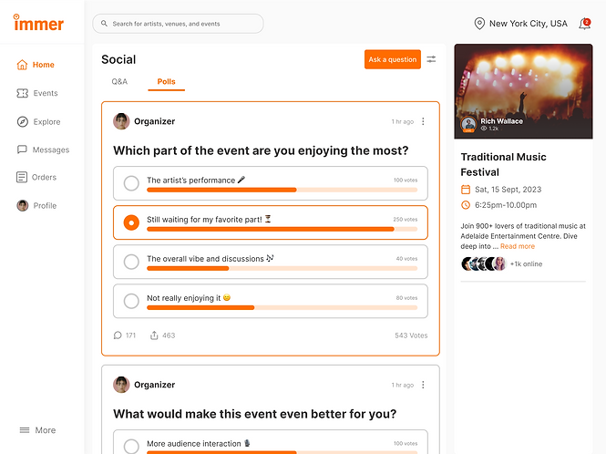
added option for Q&A and polls
Option selection made it easier for introverted users to express
SOLUTION 02
Vendor flow
“I was able to focus on the event without constantly worrying about managing the participants, it was a relief to have the tools to keep things organized.”
- Vendor after testing the redesigned host and co-host system
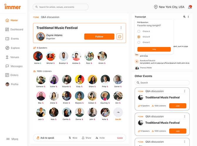
To solve the challenges vendors faced in managing multiple users and co-hosts during live events, I redesigned the vendor host and co-host system to streamline participant monitoring. I improved communication channels by introducing an automatic transcript feature for live chats, allowing organizers to easily reference past conversations, track key discussions, and efficiently follow up on important points, ultimately enhancing the user experience and improving session management.
Easily identify hosts and co-hosts and manage their roles seamlessly during live sessions.

Easy access to transcripts helped understand
different accents and keep track of the conversation effortlessly
access to user analytics made it easy to track Q&A responses and poll participation in real time.

FINAL RESULT: POST LAUNCH
Providing access to Polls resulted in a 23% increase in user engagement
Led to 22% increase in Live chat participation and a more inclusive environment, improving overall user satisfaction
KEY TAKEAWAYS AND LEARNINGS
Hierarchy Enhances Clarity
Established a clear visual and functional hierarchy that helped users quickly navigate, reducing cognitive load and improving efficiency.
Information Architecture Matters
Structured data logically eliminated friction and ensured users could navigate seamlessly without confusion.
Decision Simplicity
Reduced the number of actions required for key tasks improved usability, helped me ensuring users weren’t overwhelmed with too many choices
User engagement increased by 18%, as participants could easily reference past conversations, leading to a more seamless experience.
Improved organizer efficiency by 2 times, reducing follow-up time and enhancing discussion tracking.
Design as a Communication Tool
Design became a powerful way to communicate ideas, with visuals helping to clarify complex requirements and bridge gaps between technical and non-technical teams.
Business Considerations and Management
Business-Driven Design: Aligned UX decisions with business goals to streamline communication, reduce response times, and boost vendor efficiency.
Stakeholder Collaboration: Worked cross-functionally to ensure the feature met both user needs and market demands, strengthening Immer’s competitive edge.
Impact-Driven Approach: Prioritized usability, clarity, and efficiency, improving vendor coordination and reinforcing user trust.
Take a moment to check out the amazing designs below, showcasing the solutions I crafted to address other key challenges for mobile approch

What did my day-to-day role look like?
At Immer, I had the thrill of designing mobile and web applications that didn’t just connect artists with their audiences—they redefined how events and entertainment could thrive in the digital space. Competing with platforms like TwitterX, we aimed to create something more personal, seamless, and impactful for creators and their communities.
What I actually did :
-
Lived in Miro and Figma: I created over 100 wireframes and prototypes, constantly testing and iterating to make sure the designs weren’t just functional but also delightful. Balancing user needs, stakeholder visions, and market competition kept me on my toes and I loved every second of it.
-
Battled usability quirks: By diving into surveys, competitive analysis (hello, TwitterX!), and user research, I pinpointed pain points and worked with the team to make fixes that felt intuitive and user-first.
-
Revamped user journeys: Using the double diamond method, I streamlined user flows, slashing extra clicks and creating an experience smoother than scrolling through a perfectly curated feed.
-
Brought the MVP to life: Collaborating with stakeholders and designers, I helped shape a product that wasn’t just functional but left a lasting impression. Think: easy to use, engaging, and exactly what users didn’t know they needed.
What made it fun? Competing with industry giants like TwitterX and knowing we were creating something unique.
What made it funny?
Realizing that sometimes, the best ideas come from “What if we tried this ridiculous thing?” moments—and they actually work.

The Immer platform has not yet launched. With such great test results, I'm looking forward to seeing how the feature performs!
MORE PROJECTS
Product Design
User Research
B2B
SaaS
Digital wallet
Most impactful

UX Research
Card Sorting
Tree Testing
User Interviews
Most impactful

Product Design
User Research
Surveys
0→1
Intuitive journey

Visual Design
Color theory
Typography
Intuitive journey
